It’s been a couple weeks since I’ve done a makeover. And no time like the present to get back on the horse. So here we go! What are we looking at this week?

Okay, so we’re looking at something that probably all of us have looked at some point…our electric usage. So here we’ve got a dataset of entire years worth of energy usage down to at least the hour of every day.
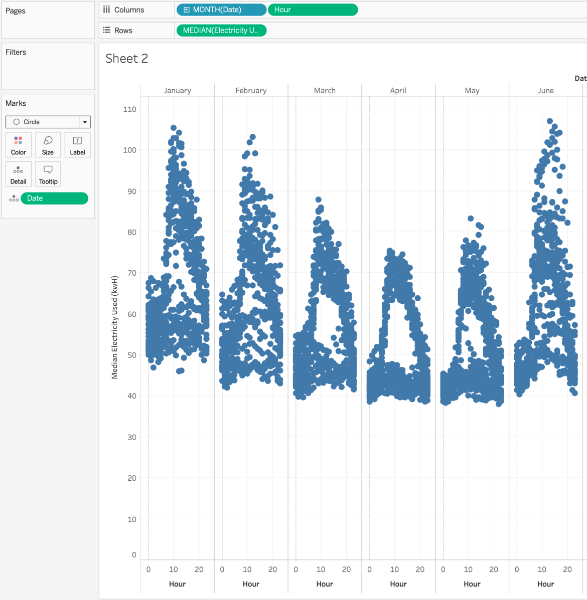
A dataset like this allows us to look at seasonal trends. And I think it would be really cool to see this data as a strip plot. Strip plots are really good at showing cyclical trends. Here’s what I created:

Want to see how to build them? Here we go!
The first thing you need is a high-level dimension. This will be your column headers. In my example, I chose to separate each column by discrete month

And then for each month, I want to see what the median energy usage was across each hour. Tableau will default this to a line, we’ll change this is just a bit.

Lastly, I also want to see the energy usage for each hour AND day of the month. For this, I’ll need to add the exact continuous date to detail. Again, Tableau still thinks I want this be lines

Now, by definition this is a strip plot. However, I think that instead of connected lines, I want to see an individual dot for each day and hour. And to do that I simply need to simply change the mark type from line to circle
And now it’s time to format. The first thing to do is reduce the opacity to 60%. Then I’ll add my measure to color and choose the Red-Gold palatte.
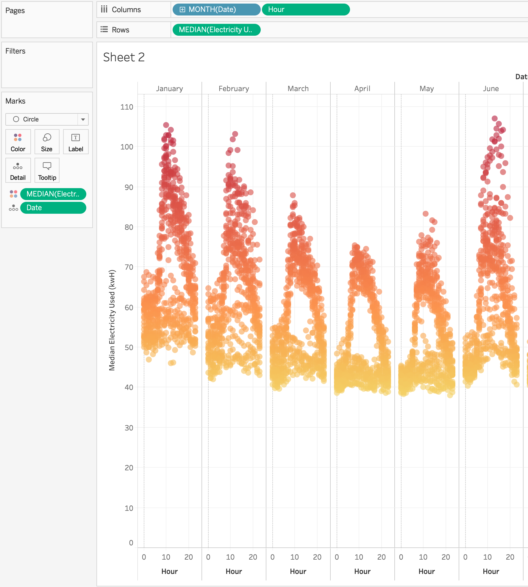
Next I’ll edit the energy (y) axis to remove zero which will give the marks more room to breathe. I also don’t need it because the energy usage will never be zero. While I’m formatting axes, I’ll also edit the hour (x) axis and set the axis tick marks to have a tick every 12 units. I chose 12 because there are 24 hours in a day so this will do help the user see where they halfway point is for each day.
The last bit of formatting that I’ll do is to remove the dotted zero line on the hour (x) axis as it’s an actual value rather than simply the start of the axis.
The last thing I’ll add to this sheet is a secondary axis line on the median energy usage for each month to show the line of best fit.

For the dashboard, I was struggling to have find a way to present this and then I had an idea of an easter egg. And the other day, my kids were watching some old School House Rock and they have a song about electricity. So now users can listen to the song while they explore my dashboard.
GO FORTH AND VIZ!