Hello again! Welcome back and as always, thanks for reading!
For week 5 of #MakeoverMonday 2019, Andy has given us a stacked bar chart from the European Commission looking at the Digital Economy and Society Index scores for countries in the EU across 5 categories.

What works well
- sorted best to worst
- legend is clear
- title is simple enough
What could be improved
- Stacked bars are good for cumulative comparison but as soon as you add the colors to each bar, I think instinctively a large number of will want to compare the parts to each other. And in this display, doing that is extremely difficult.
I think there’s a way that we preserve the ability to see and compare the cumulative indices AS WELL AS being able to compare each the individual parts.
I think a multi-dimensional dot plot is the best way to visualize this data. I remember WAY back in week 17 of 2017 (Apr. 24) of #MakeoverMonday that Tableau Zen Master, Matt Chambers created a dashboard that is extremely close to the one I want to build for this week. Back then we were comparing a list, compiled by LinkedIn, of skills in high demand. Here is what Matt created, click the picture for the interactive version:

He even wrote up a blog about highlight action piece.
I’m going to #StealLikeAnArtist and use this as a framework for what I’m going to build. Here is what I built. If you want to learn how I built it complete with data prep and calculations, I encourage you to continue reading below, otherwise, click the screenshot for the interactive version

The Data
As I started playing with this dataset and started building out some prototypes, I wanted to keep the original idea alive with the ability to see the overall score but our data as it stood did not have an “overall” category so I needed to make one. I’m sure there are many ways this could’ve been achieved but I chose to go the route of using Tableau Prep.
The dataset is set up such that each row represents a year, country and category and there are 5 original categories. And essentially what I need to do was to create a 6th category which would be the sum aggregate of all the categories for a country and year. Below is a screenshot of my Prep flow.
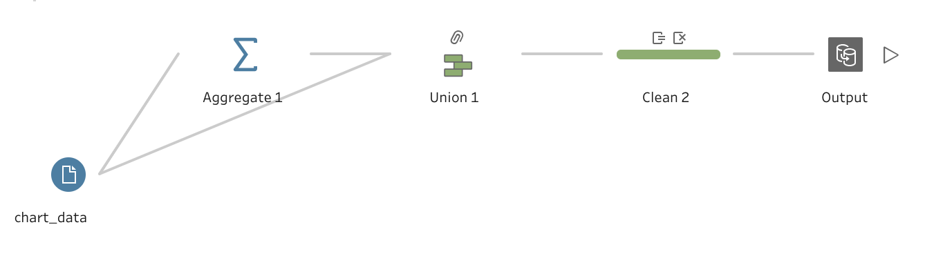
The first thing I did was to aggregate the scores for each year and country

Now that I had this piece, what came next is to union this aggregate with the original dataset. And through the beauty of Tableau Prep, it knows to match all fields with the same name and because my aggregate didn’t create any new columns, all it did was add a null dimension member to the [Indicator] field

And then I renamed the null value as “Overall Avg” and that’s all it took to add my 6th [Indicator]. And with that, I’m ready to build in Tableau
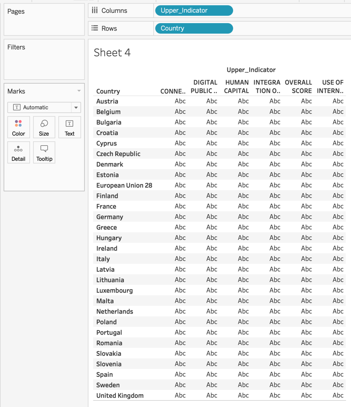
The first thing to do is add [Country] to rows and [Indicator] to Columns
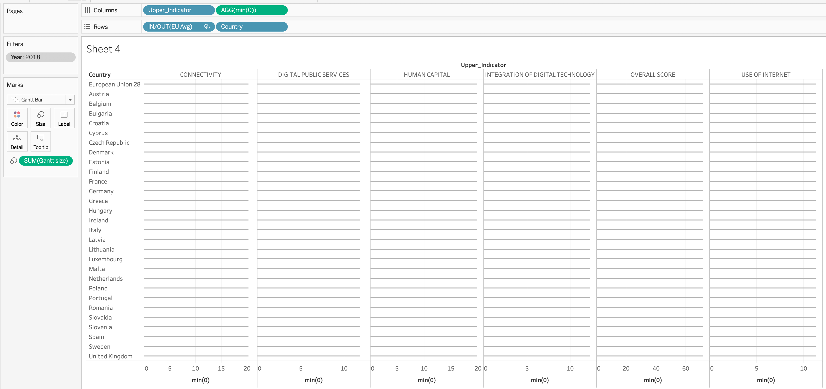
Okay, you see that “European Union 28” row? That’s the overall average regardless of how the user chooses to sort, I want that row to always be the first. It’s also going to be the value that I compare each country to. And in order to get that to happen I’m going to create a “hard code” set of just that member.

And when I add that to the highest level of my rows shelf I get this view

And now I can hide that header and it look just like the original but EU 28 will always be at the top. This is be very handy later on.
Okay, if you look at my final product above you can see that I have a line for each mark for the circle to sit on

That line is a simple gantt chart that goes from zero to the max score for each category and year. So do this I created an in-shelf calculation of Min( 0 ) on columns

This look weird right now but now we need to create a size calculation that will extend the gantt bar out to the correct length. So I want to know for any single year, what was the maximum score for each category regardless of country. That sentence screams “LEVEL OF DETAIL CALCULATION!!!!”
# Gantt Size #
{ FIXED [Indicator]: MAX( [Weighted Score] ) }
“But Sean!”, I hear you say, “What about year? Didn’t you say you wanted ‘Year’ to be in the calc too?” Why yes, I did. But [Year] will be a filter and I can manipulate the order or operations by add the year filter to context so that the LOD is aggregated AFTER the year is filtered.

Now I can edit my MIN(0) axis (or x-axis) to have independent ranges, set the mark size to the smallest possible size and change the color to a medium gray.
Now I can simply add [Weighted Score] to the columns shelf and make it a dual axis (don’t forget to synchronize), change the mark type to circle, adjust the size of the circle and…

It’s starting to come together. Now, I want to color each dot based it’s position relative to the EU 28 value for each category.
# EU Avg #
{ FIXED [Indicator]: MAX( IF [EU Avg Set] THEN [Weighted Score] END ) }
# Color #
[Weighted Score] <= [EU Avg]
Then I’ll put that last calculation on the color shelf of the circle mark card

The next piece of functionality for the final dashboard I wanted to add was the ability to sort by any one of the indicator categories and have it defaulted to the “Overall Score.” So the best/easiest way to do that is through a sort parameter. Here’s how I set up the parameter

Now the calculation to make this parameter work involves some additional work, I will need to create separate measures for each of the different categories. Here is one of the calculations
# Connectivity #
IF CONTAINS( [Indicator] , “Connectivity” ) THEN [Weighted Score] END
Then I just duplicated this for each of the 6 indicators and updated them appropriately. Then my sort measure that I’ll use to make this work looks like this
# Sort #
CASE [Sort by:]
when 1 then null
when 2 then [Connectivity]
when 3 then [Human Capital]
when 4 then [Use of Internet]
when 5 then [Integration]
when 6 then [Public Service]
when 7 then [Overall Score]
END
Then I’ll sort my [Country] field descending by this new field.
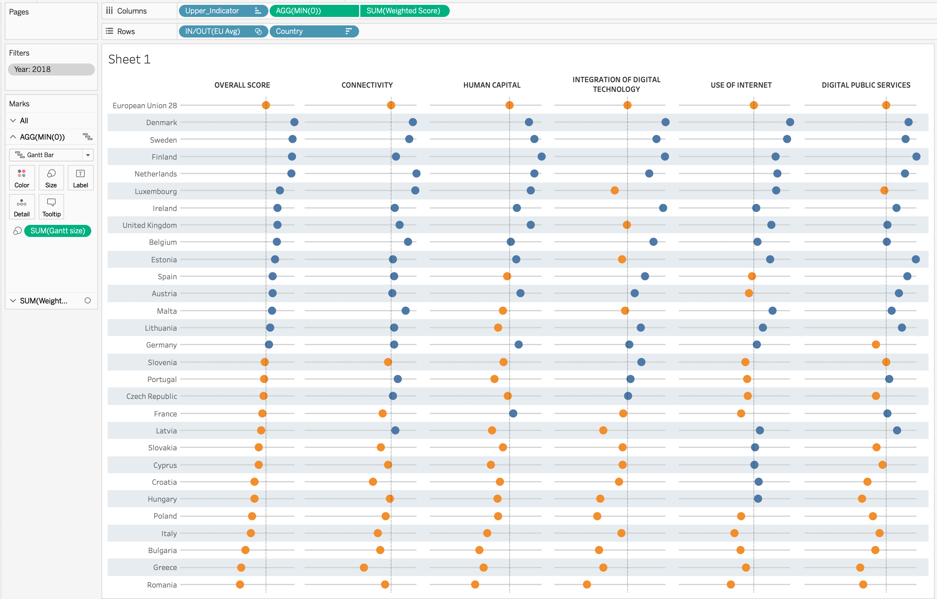
And that completes the technical portion to the viz, the rest is formatting. Simply put, I went to the European Commission website and saw that they use blue and yellow as their primary colors. So those are the two colors I used in my final dashboard.
Click the screenshot for the interactive version
I hope you picked up a few tricks. Now…
GO FORTH AND VIZ!