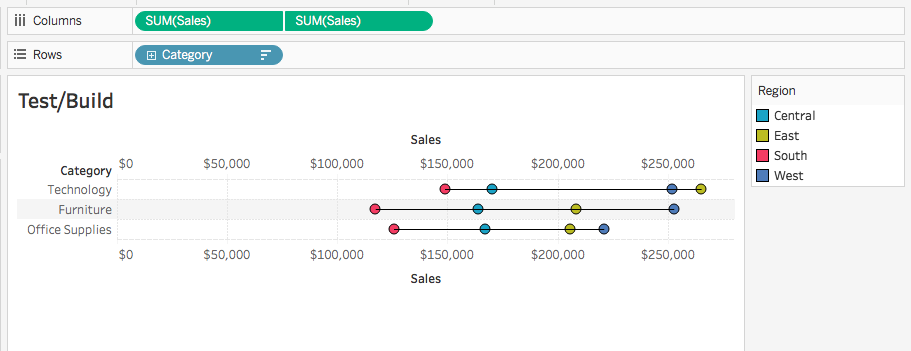
Week 6 of #WorkoutWednesday has us taking a looking at a dot plot across a product hierarchy. Here’s our challenge


Requirements
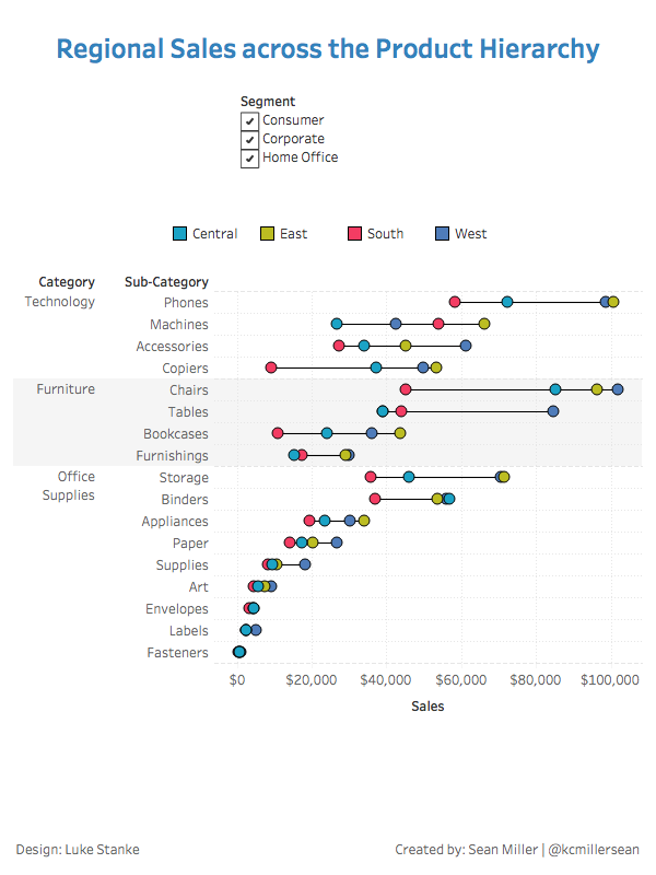
- The dashboard size is 600px by 800px
- You must use Category and Sub-Category in your product hierarchy.
- Right-align each member in the hierarchy.
- Sort each level in the hierarchy descending by sum of sales.
- Match the color on Region using a palette. You may not custom assign, you must assign a palette that comes with Tableau.
- Show “lines” going from the region with the lowest value in a member of the hierarchy to the highest level.
- Make sure the min/max “lines” also sits between a horizontal grid line.
- Make the “lines” between min/max values appear as a thin black line.
- Use Segment as a filter.
I have to admit this one pretty easy. However, there were a couple curveballs in there. Those being:
- How on earth does the Hue Circle color palette work? It’s doesn’t behave like other palettes.
- Also, row banding. Simply because I don’t use it that much.
However, in keeping with tradition, allow me to show you how I go about making my connected dot plots
There are at least two ways (probably more) to create a connected dot plot. And, for me, it depends on what information/data I want to include in my viz. If the viz calls for showing or displaying the difference between the marks, then I’ll use the “gantt” method. In other cases, as in this one, where the difference is not going to be displayed, I tend to opt for the “line” method.
The first thing I do when I create a connected dot plot is to create the dots. We’re looking at sales here so I’m going to put SUM([Sales]) on columns with the hierarchy on rows. I’m also going to change my mark type to circles.

Next up, I need to create different dots for each region. I also know that I’m going to be coloring these dots by region. That means I need to put the [Region] dimension onto the Color card.

Now, while I’m here talking about color let’s talk about the Hue Circle palette. In Luke’s screenshot at the beginning of this post and in his requirements, he states,
Match the color on Region using a palette. You may not custom assign, you must assign a palette that comes with Tableau.
I played with every out-of-the-box palette to figure out how to get these colors correct. At the bottom of the list when you are editing a discrete dimension is “Hue Circle” it looks like this

Now for those who are familiar with how the “Assign Palette” works; if you click it it will start with the color in the first row, first column, then go down each column. If that were to happen with this palette, then all four of our dimensions would be all blue with West being green. But that’s not what happens with this palette. Here’s what it looks like when you click “Assing Palette”

What kind of Tableau magic is happening here? Is Tableau using the number of distinct members of the selected field to find that number of colors that are as far apart as possible from all the other colors? I don’t know, but it’s pretty cool and the best part is; I LEARNED SOMETHING NEW about Tableau this week! Hooray!
Okay back to the viz – here’s where we are

I added the black border to the circles per the requirements. Now it’s time to create the lines to connect the dots. I’m going to duplicate my measure on columns, this adds a second marks card for me to manipulate.

Now what I’m going to do is change my mark type to line.

That’s not what we want but Tableau is trying to assume how we want our lines connected. So it’s connecting the line for each category with region still on color. But I want to connect every region within each category so I’ll just drag region to the Path card and watch what happens

Now I’ll set a dual axis and synchronize (side bar: don’t you think the axes should be synced by default?). While I’m at it, I’ll set the color to black and the size to the thinnest possible
That looks like what I want however, I want my line to be in the back. To do that will simply drag, my first green pill to the other side to make the second, this will move my line marks card to be above the circle marks card

This is one of those features that is often overlooked and taken for granted; the ability to choose what order dimensions and/or marks are displayed. I’ve learned through trying out other data visualization software that this is feature doesn’t exist in others or is very hard to do. While in Tableau its as simple as a click and drag.
Now the rest of the viz is pretty straightforward
- Set the row banding
- Create a FIXED LOD for the sort
- Format the gridlines
- Create the dashboard
Click the screenshot below for the interactive version or to download a version for yourself.
Until next time!