Andy’s chosen another sports data set for week 21 #MakeoverMonday. This weeks dataset is looking at Premier League predictions vs actual final standings.

What works well & What could be improved
- This isn’t really a data visualization so this doesn’t apply
So let’s get one thing straight at the start – predictions in sports are pretty worthless. They give us fans something to debate over and maybe bet on if you are that’s your thing but there’s no value outside of that.
Now that we have an understanding, let’s get to vizzing. I really like the basic structure from above. I think I want I just want to add lines to connect each team on both sides. This will add a visual queue to further highlight how well or poorly a team fared compared to the prediction.
Sidenote
I would like to Tableau to add the functionality to do some data shaping when using web data connectors. Data.world is an awesome platform and they’ve created a Web Data Connector for any dataset on their site that you can connect directly to Tableau among many other data apps. However, Tableau doesn’t allow you to to pivot the data. If you want/need to do any data shaping in Tableau, you first need to download a local copy of the data. If you think that having shaping functionality is a good idea, please upvote this idea on the Tableau community forum
Back to the Viz
As mentioned, I wanted to create a slope chart that would connect each team to quickly & easily the difference. Click the screenshot below for the interactive version
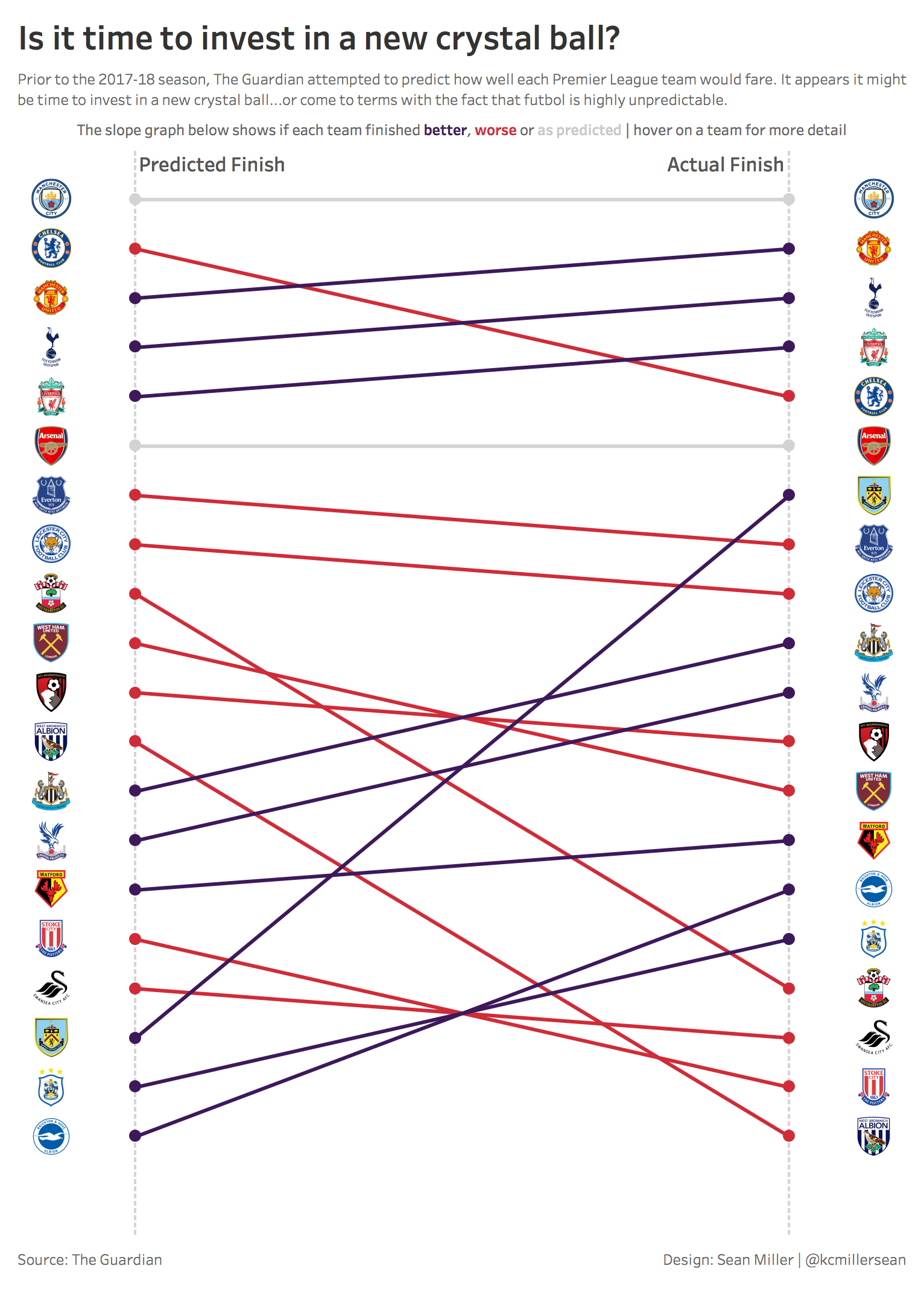
Now you can quickly see which team did better or worse than predicted. I also added a bit of interactivity. Hovering on a team or line will highlight the team and line.
In the original accompanying article from The Guardian, they wrote a little blurb about each team’s prediction and result. I took the liberty of taking those blurbs, created a nested CASE() statement with each of the blurbs so now when you hover on either side, you’ll see what The Guardian had to say.
Until next time!