If there’s one thing that Ann is consistent with, it’s her color palettes. Rarely, does she ever use the default “Tableau 10” palette and among her top favorites is definitely Nuriel Stone.
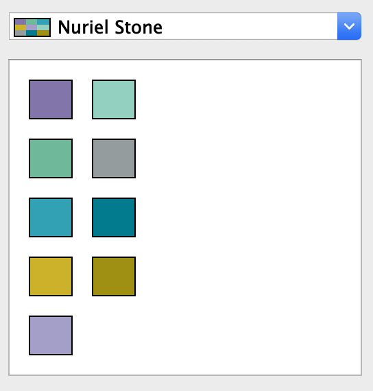
And I must admit, it’s a really nice. (Sidebar: I actually had the opportunity to meet with and talk to Nuriel at TC18 last year. Yes, she’s a real person, I met her at the Tableau Labs and she’s credited for this color palette.)
So as soon as I saw the notification that the week 2’s challenge was up, all I needed was to see the screenshot and could instantly tell it was Ann’s week. So we go!

Now this is going to be really fun because I’ve never a calendar used like this before; let alone build one. Other than that we’ve got a jitter plot of sales by order id and parameter that switches between filtering and highlighting based on the calendar selection.
I think for this walkthrough, I’ll go top to bottom first then cover interactivity.
The first thing I need to do is filter the dataset to the most recent 6 months. I’m going to use a relative date data source filter to do this. Don’t be like me and forget to set the anchor date to 12/31.
Calendar
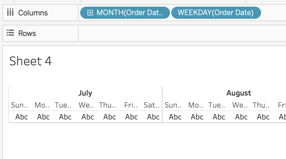
As I mentioned, I’ve never built one of these before but I’ll take a stab at it. If you’ve ever looked at a calendar before you know that it’s set up with a month header and weekday headers in columns and then each row is a new week. So quickly if put month part and weekday part on columns I can start to see this come together
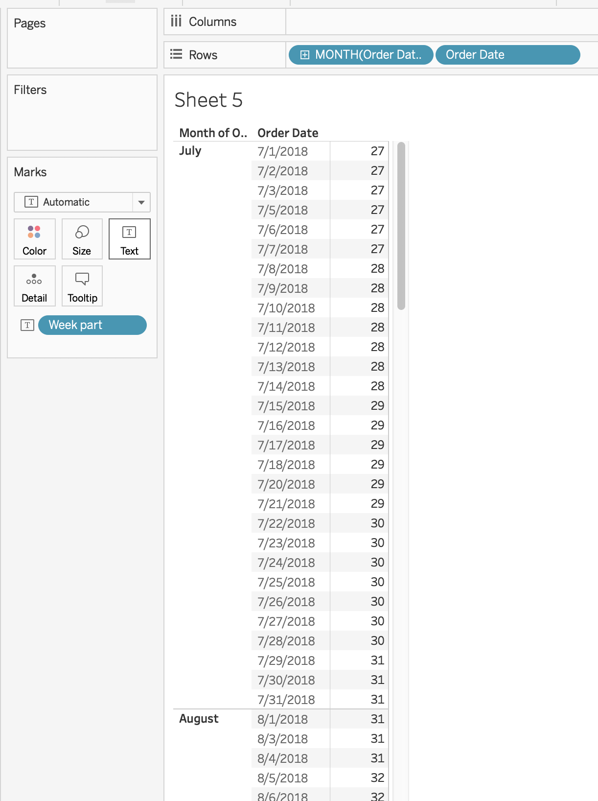
Now for the rows, I struggled a bit and finally had to take a peek. I knew that I couldn’t just use the week number date part because that’s a rolling calculation and I essentially just needed the number of weeks per month restarting each month. My first stab was to simply do an INDEX() function at the week number level restarting every month and that got me in the ballpark

however, it the day parts aren’t in the correct order and the reason for this is because there were no sales on July 4 so Tableau puts the 11th as the first Wednesday and therefore all the Wednesdays will be moved up. So this approach is dead in the water. Time to think of another way of going about it.
So this is what I really like about #WorkoutWednesday, It’s all learning. Don’t be afraid to take a peek (in the spirit of LEARNING. If you peek to simply complete the challenge, that’s copying, not really admirable and I think you should reevaluate your reasons for participating in these challenges). As soon as I peeked, I instantly knew the logic behind it and was able to articulate why this solution works.
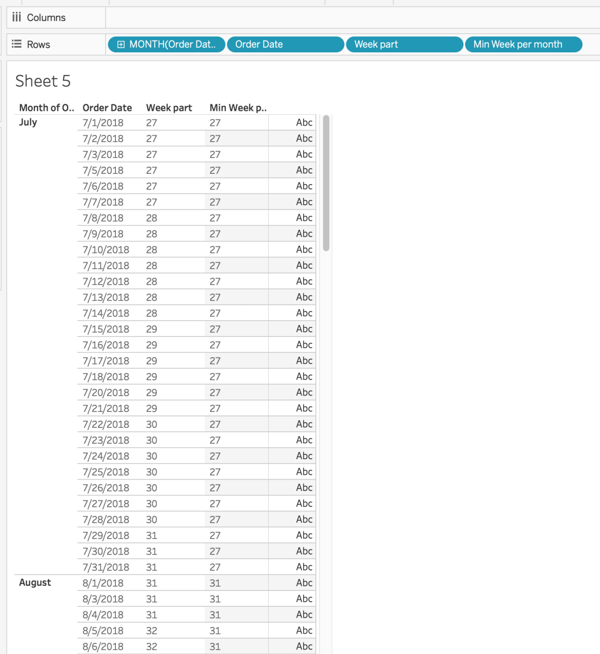
So what I chose to do was create a new calculation to calculate the week part for each [Order Date].
DATEPART( “week” , [Order Date] )
So you see how it returns the week number for each date? Next, I’ll write a calculation to return the minimum week number for each month and I’ll do that with a LOD
{ FIXED MONTH( [Order Date] ) : MIN( [Week part] ) }
So for each month in our data set, please return the lowest week number. [Umm, yeah I said “please” because my mom always told me to be polite. Love you, Mom!]
And here’s what looks like
Any guesses what the next step is? Yep! to subtract the two numbers!
[Week part] – [Min week per month]
And this results in exactly what I was wanting, an index of the number of weeks of any given month. I was making it too difficult originally.
That’s why we do these. To instill the ability to approach challenges in different ways.

And now when I take that new index field back to the calendar replace it with my original INDEX() I get

This looks great. Now to get it to look like Ann’s, I’ll remove day part and change my mark type to square, size it up just a touch and change the mark color to the pink and…

Looking good! Who’s ready to do some jittering?
Jitterplot
First up, what is a jitter plot? Simply put, A jitter plot is a way to show distribution on one axis and we scatter each mark by a random number on the opposite axis to help better understand the distribution.
So I can see from the screenshot that [Region] is on columns and in the requirements I am to show the sales for each order but when I do that, there are some huge variations in the sales numbers are skewing the axis. It appears as though these values have been normalized. This will be pretty easy as Ann’s prior challenge was also about normalizing values.
( SUM( [Sales] ) – WINDOW_MIN( SUM( [Sales] ) )
/
(WINDOW_MAX( SUM( [Sales] ) ) – WINDOW_MIN( SUM( [Sales] ) )
I’ll change my mark type to Circle, [Region] on columns and [Order ID] on the detail shelf of the marks card
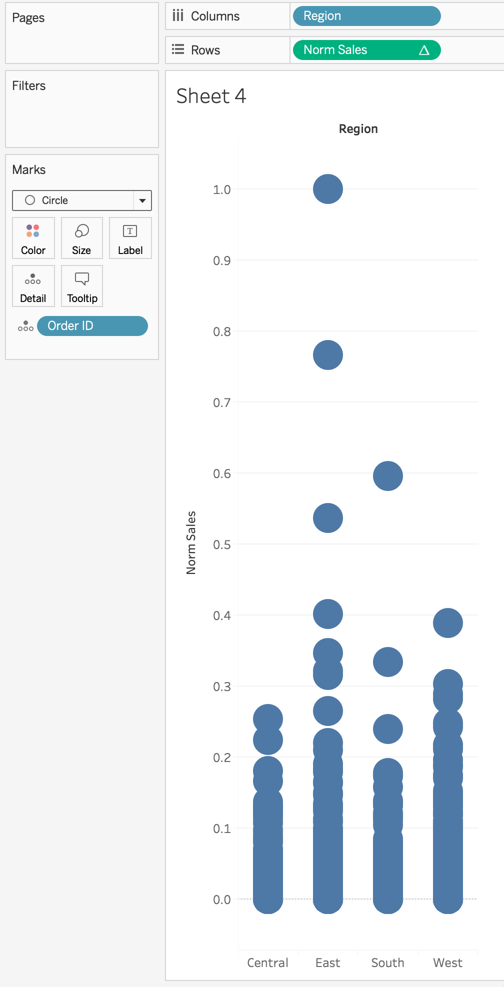
This is a nice distribution plot and now we need to spread each of those dots out horizontally for each [Region] while keeping their vertical position the same. The easiest and best way to do that is with an INDEX() function calculated on [Order ID] & [Region] at the level of [Order ID]. 
Now the first thing to do after applying the jitter is to hide the x-axis header as the position of the dot on this axis is irrelevant. As mentioned before, Ann is using the Nuriel Stone color palette so I can go ahead and do that now as well
Interactivity
So here’s the deal, I had a conceptual idea of how to go about it but everything I tried didn’t work. And I was getting frustrated and then my good friend, Curtis Harris posted his video specifically about how to accomplish the set action. So I used his strategy in my solution. Check it out.
So now that we’ve got the actions working and everything, the next thing I’m going to tackle is the Avg Sales annotation at the bottom of each column aggregating for the selection of marks
There were a couple different way’s go about it here’s the one I chose
{ FIXED [Region] :
AVG( { FIXED [Order ID] :
SUM( IF [Action Set] THEN [Sales] END )
} )
}
Okay, this may look scary but let’s take it slow and work from the inside out. Line 3 is going to only return the sales number if it’s IN the action set. Line 2 says, let’s sum those sales figures for each [Order ID] and lastly, line 1 says let’s take the avg sales figure for each [Order ID] in each region.
So now that I have that number, I need to get it onto the view somehow. When I looked at Ann’s version and I hover on the text, I can tell that it’s actually a mark label of the tiniest mark possible at 0. This is one of the more powerful ways to utilize a dual axis chart in Tableau. I can add MIN(0) to the view and change the mark size to the smallest possible and reduce the transparency to 0 and it basically disappears. And now, I’m free to put that new field above onto the text shelf of marks card and simply play with the text box to get it where I want it.
And with that…

Thanks for reading
GO FORTH AND VIZ!