March is Women’s History Month and #MakeoverMonday has partnered with Equal Measures 2030 for week 10. And we’re looking at what and how well policymakers know about issues concerning women and girls around the world. Here’s the original:

What works well
- The layout is easy to read
- The colors are consistent
- The labels/legends are easily/quickly discernable
What doesn’t work well
- I’m struggling to understand what the blue diamonds represent
- There is no x-axis
- The first indicator, maternal mortality rate is greater that 100%, I’m not sure how that is possible
So looking at the underlying data, it looks like we have a number of policy makers from each country who were asked about the same issues. They were asked:
- Their confidence level in knowing what the answer was:
- I know
- I don’t recall, but I know where to go for the information
- I don’t know and I don’t know where to go for the information
- Their estimate or guess
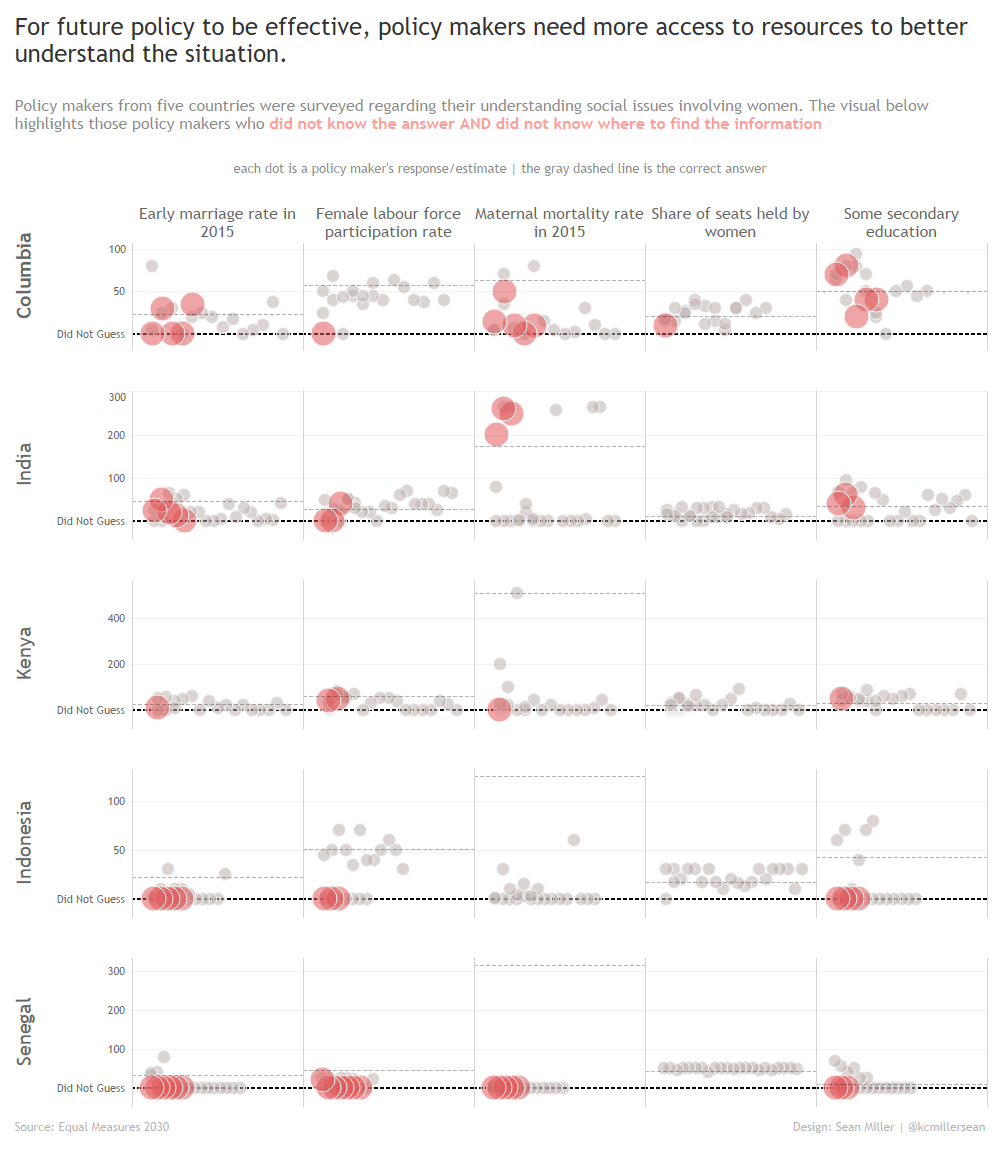
As I started playing with the data, I decided to focus on those respondents who didn’t know the answer AND didn’t know where to go for the information. First I want to applaud these folks for being honest. If when you are anonymous, for many it can take a big swill of pride to admit that they don’t know the answer and aren’t even sure where to go for the answer.
I chose to focus on this group becaus I think it highlights an important issue with public service. When you see data like this, and then think “These are the same people making rules and laws that could last generations” it can be depressing a bit but all the more reason to highlight it demand change.
So what was interesting in looking at that data is that some respondents who admitted that they didn’t know and didn’t know where to go for the answer still provided a guess or estimate.
Here’s what I came up with. Click for the interactive version
This particular makeover took a bit of “Tableau-magic”
The first thing I needed to do was use the ZN() function to plot the dots for anyone who did not provide a guess. This worked because no guessed 0. Once I had all the dots plotted, I formatted numbers as such:

Whenever you use the custom number format, the order you put things in, separated by semicolons looks like this
[Positive Numbers];[Negative Numbers];[Zero]
So in my case, the zero is replaced with the text “Did Not Guess”. This little trick is extremely helpful if you need to do some kind of customized axis as in this case.
Then I formatted my zero line to be the dark black dotted line.
Feel free to download and dig in to find some more nuggets
Until next time!
