The Question
Back again with another viz. But I’m gonna throw you for a loop here. It’s NOT about music this time…OR baseball! I know, crazy, right? Well, the great thing about this wonderful world of data we live in is that “The Data is Out There” you just have to know what to do with it!
So it’s early fall which means that it’s football season again. Growing up in the 90’s in Kansas City means that I’m a die-hard Chiefs fan, for better or worse. Needless to say, things are looking good this season but it’s a long season, so we’ll see what happens.
During the offseason, as in every NFL city, the topic of salaries, salary caps, free agency, and franchise tags is all the rage for the sports talking heads. And that got me thinking:
- How is the salary cap even determined?
- How does one team compare with how they are spending their money?
- I’m a Chiefs fan so I can tell you about our roster but I couldn’t tell you whether we’re spending more many on wide receivers or offensive linemen
- What percentage do our star players make compared to the total salary?
The Data
Now that the easy part was out of the way (asking questions is easy!), I needed to find the data. I found the amazing website called Spotrac who’s sole purpose is to keep track of salary data for each of the major sports leagues. But there’s only one problem, it all just tables of rows and columns. This is good for knowing the value of any one player, or one team but it’s terrible for comparison, which is what I wanted.
I scraped the data using the =IMPORTDATA() function in google sheets with one workbook per roster type with a sheet for each team. I then unioned them all in Tableau. BOOM! Let’s get to analyzing
The Analysis
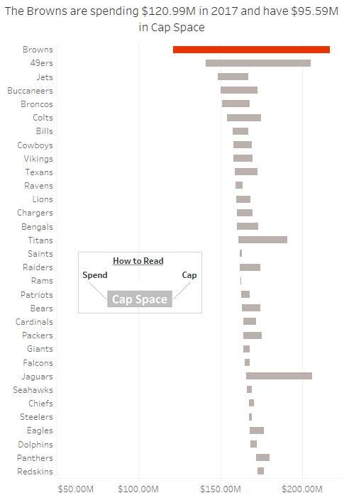
I really wanted to answer each of the questions I had from above. The first thing that pops out at the user is the Cleveland Browns have SO MUCH cap space. Nearly $100 million worth of cap space. 
To the non-Browns fan, this may make you think that they are simply a terribly run organization or that the team owner is stingy and doesn’t want to spend money for his own personal benefit. That’s I thought and I like to think I’m pretty up on the NFL happenings but alas, I was sorely mistaken.
This insight was so shocking to me that it led me to do more external research. Aside from googling, I actually had a conversation with a colleague who was himself a Browns fan and turns out, the owner isn’t stingy with this money, they are simply trying a revolutionary experiment.
Early in the 2016 offseason, the Browns went out and hired Paul DePodesta to be the teams Chief Strategy Officer.
Baseball fans might recognize that name. Paul was the brains behind the “Money Ball” movement. In short, Money Ball is the idea of using advanced analytics to find talent with a higher upside for cheap. The latter is the key part. This is all about finding the biggest bang for the buck. This brand of strategy will err on the side of the analytics.
So has it worked? I feel this could be a separate visualization itself, but since hiring DePodesta the Browns have won only 1 game as of this writing. They’ve played 23 games.
This is one of MANY stories contained in this visualization. Click here to explore your team and find some insights of your own!

The Guts
If you’re sticking around for this part, I’m going to take under the Tableau hood to share some tips and tricks that I used to create this dashboard. Continue at your own risk 😉
The Color Scheme
As I started to design this dashboard out, I knew that I wanted to allow the user to select their team of interest but as they explored I wanted to give them some clues to remind them which team they were looking at.
Some other clues that I’d use were using the team name throughout the dashboard in titles, tooltips, and annotations. Another clue would the team logo icon that changes with the selection.
When I started to think about color, I thought it would be cool to have the color scheme of the dashboard change throughout depending on the team selected.
So the tip I want to explain here is the power of Tableau’s “Combine Field” and Default Properties functionalities.
Combine Field
In this dashboard, I’m using a simple parameter for team selection and the calculation that is driving the selection is simply checking if the parameter select is equal to a team in the dataset. This creates a T/F Boolean calc and all rows of the selected team will be TRUE, all others FALSE.

This calculation is used in some fashion on every sheet. If I want to ONLY look at this team then I filter this calc to only show TRUE values. Like in the Roster Type sheet, it looks like this

But on sheets where I want to show the selected team IN CONTEXT of all other teams, then the above will not work because it would filter all other teams out of the view. I just want to highlight the selected team. The good thing about the Team Filter calculation is that only has two values, TRUE or FALSE so I could simply put that field on the color shelf and that I could call it day. But I want to the color to change with each team. Here’s where “Combine Field” comes into play.
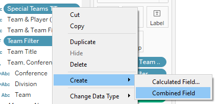
In the list of dimensions, you can multi-select a couple dimensions, right click on either, then Create -> Combined Field

The result is a new field. Now, could I have simply written a string concatenation calculation? Sure, seems cleaner and because its a native Tableau capability, you get some extra perks that you don’t get from a string calculation. Look at what appears when you edit a combined field.

- You can rename the field
- You get a count of members
- and you can change the separation character!
Pretty cool, right. And I didn’t have to write a calculation, just a couple clicks.
Okay now when you put this combined field on the color shelf you get this

Now it’s time to edit these colors. I want all the false items to be a muted grey color and the TRUE value to be the specific team color. There’s website out there, cleverly called TeamColorCodes.com that is just that, teams from every league and their respective colors in hexcode!
The easier part of this process is to simply shift+select all the FALSE items in this list and find the proper grey color I’m looking for. Then for select my custom color for the one TRUE value. That means that I started with the Browns selected in my parameter then
- changed that color
- selected the next team in the parameter
- edited that new team’s TRUE color
- repeat for all 32 teams
Yes, there’s a bit of legwork in this process but the result is such a clean and streamlined experience for the user. Here’s a side by side of two different teams for comparison
As you can see, the result is clean, streamlined and personalized for the user.
I hope you learned something and are inspired to think about adding dynamic custom color schemes to your next viz!
Until next time!

