This past week, I was working with client and they were literally describing a population pyramid. So, being the inquisitive and observant guy that I am, I said, “It sounds like you want a population pyramid” To which they replied, “well, every time we have this discussion we tend to steer away from the pyramids because for us, because its really important for us to see the differences in gender across each age group. And because the bars of a pyramid go in opposite directions, it makes it extremely difficult to see those differences.”
Their response excited me for a couple reasons:
- These people have had deep conversations about data viz and have a solid idea of what they are after and the insights that are important to them
- I love a good challenge 😉
For the visual learners, here is what the client was talking about:

Now, we can see quickly that there are more women than men in the 70-74 group, but it gets a bit harder to see the difference in the 60-64 group. Now, sure we could easily add tooltips or even mark labels but the user would still be forced to do some mental math at some point. And remember, the client said they need to quickly be able to see the difference in each age group across each gender.
The first thing I though about doing was adding hidden dynamic reference lines to each gender to force a synchronized axis across both sheets:

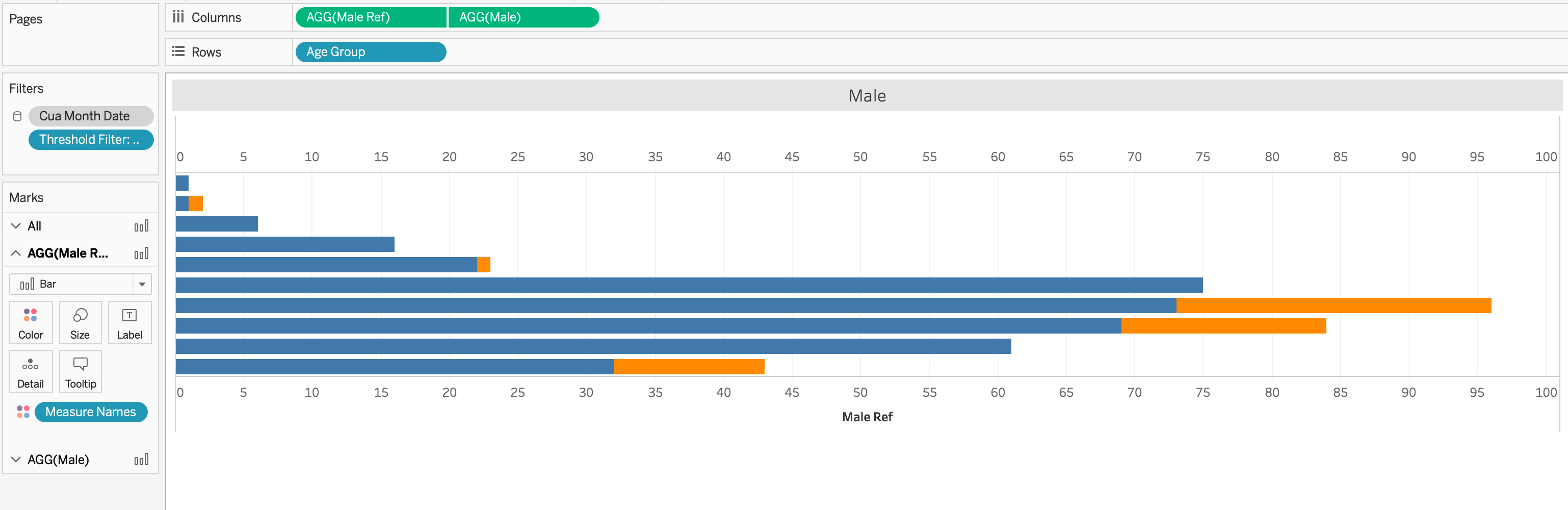
Yeah, this is much better than the first, for sure. But it’s still not doing it for me. I really think our “time to insight” can be reduced even further. (h/t: Ryan Sleeper for that phrase). Let’s remember their initial concern. They need to be able to quickly see the difference in members for each gender across the same age group. The reference lines allow us to compare across the gender but not each age group. Let’s keep building on this.
But before we do, let’s review how we got here. How did I create the reference lines? I started by making the diverging bar calculations:
#Male#
COUNTD( IF [Gender] = “Male” THEN [MemberID] END )
#Female#
– COUNTD( IF [Gender] = “Female” THEN [MemberID] END )
See that negative sign in the Female calculation, that’s the key to making a diverging bar chart. Then I customized the number format to get rid of the negative sign when displayed.
That’s how you get the bars to go in opposite directions. Now for the reference lines, I had to create a separate calculation for each sheet looking for the number farthest away from zero
#Male_Ref#
MAX( [Male],-[Female] )
If you are questioning the negative sign, my [Female] column is already negative values, so by adding an additional negative sign, it turns it back into a positive number, putting it on the same scale as my [Male] field. Then I did the inverse for the female side
#Female_Ref#
MIN( -[Male], [Female] )
Now when I add this field to the detail shelf of the corresponding marks card and add a reference line, I had to change the aggregation to minimum to the get reference line to be placed in the correct place.

Again, do the inverse for the male side

That’s how you get to a dynamic, hidden and synchronized axis across both sheets. And the wheels started turning.
- On each of the reference line dialog boxes, I had to change the aggregation to match my reference line calculation.
- And those different aggregations can be translated into WINDOW FUNCTIONS…
- And in order to do WINDOW FUNCTIONS, there must be a series of values, one for each dimension you are displaying…
- And if that’s the case, I wonder what what happen if I move those calculations from the detail shelf and place them on the column shelf?

And then make it a dual axis…?
Holy cow, I’m on to something here. Okay, I can work with this:
- Remove Measure Names from color
- Reduce the opacity to 0% for the _Ref calculation field BUT put a border of the same mark color
- and…

QUICK! Let’s do the same thing (with different fields) to the other gender and let’s look at our dashboard now?

BOOM! EUREKA!
If you’d like to reverse engineer this, click the screenshot above for the interactive version.
GO FORTH AND VIZ!