Andy hasn’t given us a challenge since Week 22 so it was good to see him come back. In fact, the #WorkoutWednesday team has already started planning for 2019. See?!
What do these five people have in common (besides an insatiable love of @tableau)? You're looking at the lineup of facilitators for #WorkoutWednesday2019 ? @lukestanke & I are continuing, @VizWizBI is returning, and both @curtisharris_ and @lorna_eden are joining us full time! pic.twitter.com/QEsLZIJMUE
— Ann Jackson (@AnnUJackson) November 13, 2018
Anyway, back to this week. Andy is challenging us to recreate his #makeovermonday submission from week 45 and the aging population.

And it wouldn’t a Kriebel challenge without a few caveats. And for this one, we can only use table calcs or in other words, NO LODs!
I really like these challenges because I feel like LODs tend to get overused or for some, it’s the default aggregation mechanism. So, it’s good to get pushed out of your comfort zone and refresh yourself on the intricacies of table calculations.
So the first thing I do anytime I’m working with table calculations is I build everything in a crosstab. This helps me see & understand what the table calculations are doing and helps me set the addressing and partition correctly.
To start this challenge I’m going to replicate just one of the 9 quandrants above then I’ll add in the other dimensions to make the small multiple sheet.

I’ve picked the top left quandrant to replicate and you can see that I’ve put year as a discrete dimension on rows and filtered the data on the sheet to only those dimensions in the top left of the original challenge.
We can see from the picture that we have two “Age Groups” 1) Children and 2) Older Adults
We can see that we have a column for each individual age across each row in our dataset. We also can deduce that children are 0-17 and older adults are 65 and over. So the first thing we should is create two calculated fields to aggregate the values for each age. Yes, that means you need to write a calculation like this
[Age 0]+
[Age 1]+
…
[Age 17]
But don’t waste a lot time typing. Don’t be afraid to do what I do in these situations and revert back to every analysts favorite tool – Microsoft Excel
I created an excel sheet and set it up like this
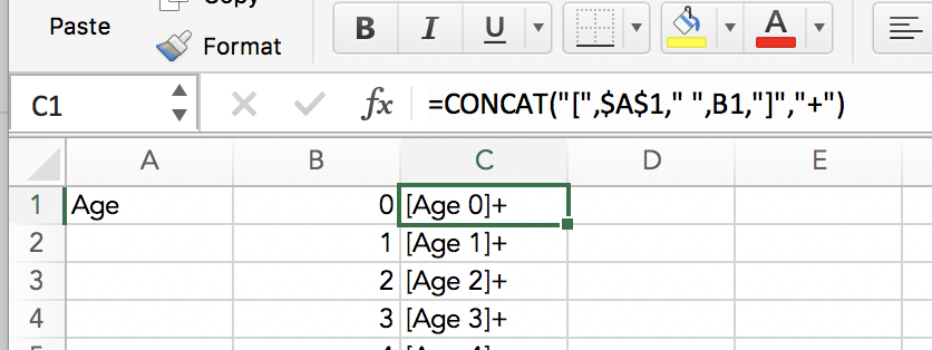
And thanks to Excel capability to fill down for a series of numbers (0-100) and copying formulas down, you can create everything you need for these two calcs in a large fraction of the time it would take to manually write out each column in a calculated field.
I use this trick a lot, it’s good for use cases like this as well as large CASE() statements
By this time, we have two new measures:
- [Children]
- [Older Adults]
Let’s go back to our crosstab and set it up using measure names/measure values
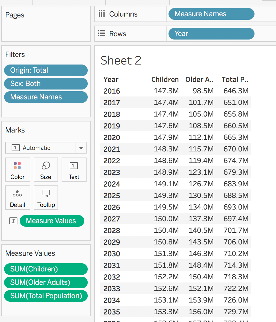
Next up we need calculate the % of Total Population for each age group. That’ll be simple enough
SUM( [Children] ) / SUM( [Total Population] )
Then a very similar calc for [Older Adults] And then add those to new fields to our view

Great! These will be the fields that will make up our lines eventually. We can check the first part off the list.
Now one of the requirements in Andy’s challenge was for for the ends of the lines to have a label and circle on them. Now I know that I can very simply add labels to line ends via the text shelf of the marks card, I don’t have a way to ONLY add circle marks for the ends of lines. The only way that is achieved is through additional marks.
So we need to write some calculations that will calculate the percentage for only the first year and last year. There are two approaches you could take here
- Row level – hard coded
- IF ATTR( [Year] ) = 2016 OR ATTR( [Year] ) = 2060 THEN [Children %] END
- Table Calc – more flexible
- IF FIRST() = 0 OR LAST() = 0 THEN [Children %] END
Either will get you want you need. I tend to lean toward the latter because this will always account for new data being added to the dataset. So, I’ll leave that decision to you.

Alright, we’ve got another requirement checked off. Next up, let’s tackle the crosspoint. Or the first [Year] in which the [Older Adults %] is higher than [Children %]
This is going to be a two step process. The first thing need to do isolate only those rows where the [Older Adults %] is higher than [Children %]. And whenever I think about “isolating rows” I Tableau translate that to INDEX().
if [Older Adults %] > [Children %] then INDEX() end
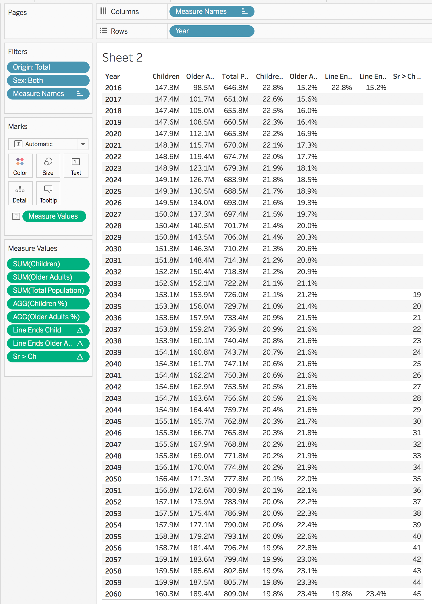
One of the many great things about Tableau is that you can use a table calc inside of a new table calc. So what we need to do now is figure out a way return only one mark at the first non-null row of our calculation above. And we want to return the [Older Adults %]
if INDEX() = WINDOW_MIN( [Older Adult > Children] ) then [Older Adults %] end
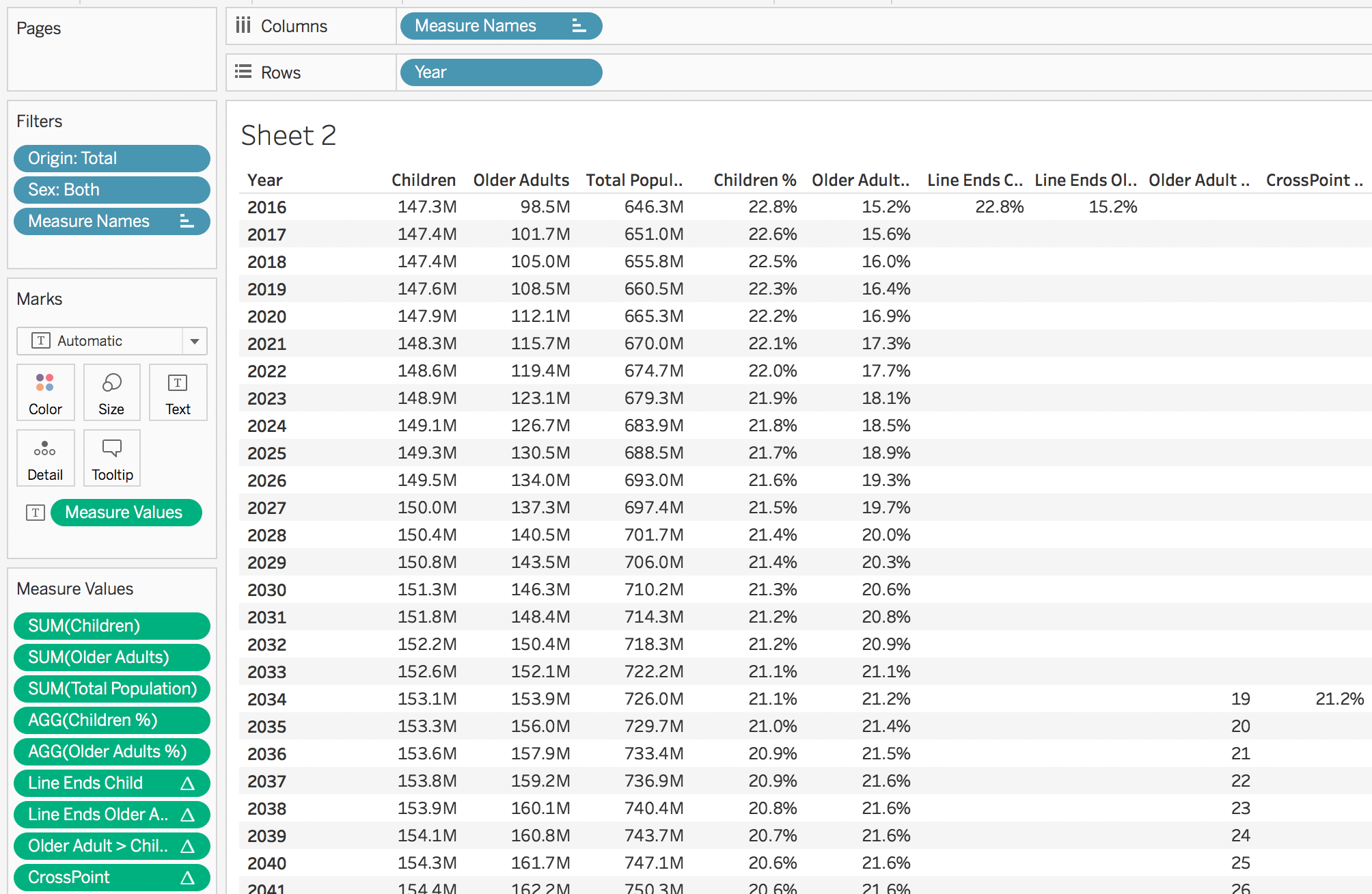
NICE!
So that will be the dot. And the last thing we need to do find a way to put reference line on the year this happened. Super easy! Let’s just duplicate the above calc and have it return [Year]

Now if we refer back to the original challenge we have everything we need recreate Andy’s design using only table calculations.
First things first, let’s move the following to detail shelf of the marks card:
- [Children]
- [Older Adults]
- [CrossYear]
- [Older Adults > Children]
We’ll remove [Total Population] from the view altogether as we don’t need it.
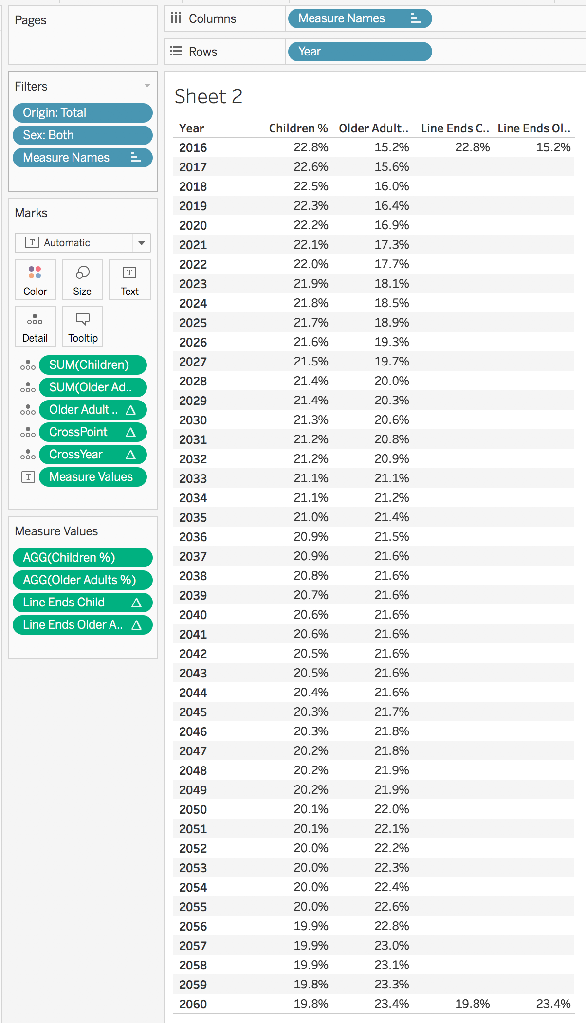
Next let’s change [Year] to continuous and move it to columns, drag [Measures Names] to the color shelf and marks card and move [Measure Values] and change the mark type on the marks card to “Line.”

This is starting to come together, eh! But what about those circles on the ends…Well, when we built our crosstab all of our table calculations defaulted to calculate across the entire table going down. And for a crosstab that’s perfect but not for a line chart. We actually want to change the line end table calcs to calculate across the table. When we do that, we get the circle ends as we desired.
Let’s do the reference line next. Go to the Analytics pane in the data window and drag out a reference line and edit the line to use the minimum [CrossYear] for each pane.

Now for the dot to mark the intersection. I could very simply add it to [Measure Values] and have it calculate across [Year] but if we do that, we don’t have any control over the size of the circle. So instead let’s make this bad boy a dual axis chart with [CrossPoint] as the secondary axis and we’ll make this mark type a circle and color it black. Don’t forget to synchronize.

This is looking really good! Now we can select text shelf of our line mark and choose to show mark values for line ends, make the font Tableau Medium, 8 pt, have font color match the mark color and…

Ugh, what! That’s not what I want. Why do we see two mark label for each line end? Well, because we have four measures in [Measure Values]. So how do we get around this?
Confession time
I had no idea, I struggled with this for way too long before I threw in the towel and sought out help. So where did I turn? Well, one of the coolest things to come out of #WorkoutWednesday2018 is something that Curtis Harris started doing. Recently he started doing a LIVE screen recording of him completing each challenge. It’s really great, you should go check it out. I really like seeing but importantly HEARING his thought process on a given challenge. And it turns out he struggled with this one too…AND we completed this challenge VERY similarly. And it was here that I learned a very cool trick. Check this out…

WHAAAAAAAAAT! Who knew this was even a thing? I sure didn’t. So it’s a lot of clicking and selecting but you are able to remove the mark label for just the […Line End] fields that we created. And this leaves mark labels for just the lines. THANK YOU CURTIS!
Okay, after we do that we get to final step. Removing the filters and adding those dimensions to rows and columns to complete our small multiple.

The good thing is that we’re so close, you can see that the mark labels are duplicated but now that we know how to handle those, it’s not going to be that big of a deal. We can see that our reference lines are working properly and as designed for each pain. But what about the[CrossPoint] circle? Why isn’t that showing up for each pane of our small multiple? Well it’s because we’ve add complexity but we haven’t accounted for how that table calc is being computed. Something to remember about small multiple is that Tableau refers to each quadrant as a pane. So when we go to edit our [CrossPoint] table calc. We should see an option to have it compute across each pane.

and when we do that we get

YES! This is perfect and the rest is just formating and polishing. If you’ve made it this far you’ve already read 1500 words so I’ll spare you the simple formatting steps and the tooltips. I’m confident you can figure that out on your own. One of the last things I’m going to show is how to give the mark labels more room to breath WITHOUT manually fixing the x-axis. We’re gonna do that with two constant reference lines.
This is kind of just trial and error but I found that a constant reference line at 2000 and 2070 looks pretty nice.
[EDIT]
Okay, so apparently I missed a requirement and Andy called me out on it.
I hate to tell you, but you can't manually set the axis. 🙂 "You MAY NOT manually fix the axis."
— Andy Kriebel (@VizWizBI) November 15, 2018
Okay, fine. I suppose setting constant reference lines is manually setting the axis. That’s okay, I can easily write a Level of Deta…wait…nope can’t do that. It has to be table calculation, right, Andy?
One of my favorite, simple table calculations is TOTAL()
So I’ll use that in two calculated fields for an axis buffer on each side
TOTAL( MIN( [Year] ) ) – 15 (again, this took some trial and error but 15 seemed to do the trick)
Then I duplicated, changed MIN() to MAX() and changed the – to +. Then I put each of those on the detail shelf of the marks card. Lastly, I edited my constant reference lines to be set up like this

Now I have dynamic reference lines that will add space to each side and will account for any new data should any arrive in the future.
[End of EDIT]
The last thing I’ll show you is how to get horizontal grid lines at only 2016 and 2060. We’ll need to edit our [Year] axis and go to the tick marks tab and set up like this.

We want our first tick and corresponding grid line to start at 2016 and there are 44 years between 2016 and 2060 so we set our tick interval for every 44 units (or years in this case). And you end up with this
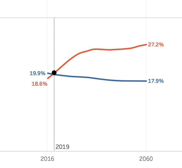
Finish up our formatting and tooltips, put it in a dashboard, give it a good title and voila!

I hope you picked up a few tricks about how to confidently work with table calculations and, in my opinion, the best way go about setting them up.
GO FORTH AND VIZ!
0 comments on “America’s Aging Population – WoW Edition”